


Nevermore Quoth Raven
He Was Supposed to Have Read Issue 350

Ha-Ha I Made You Review Spawn
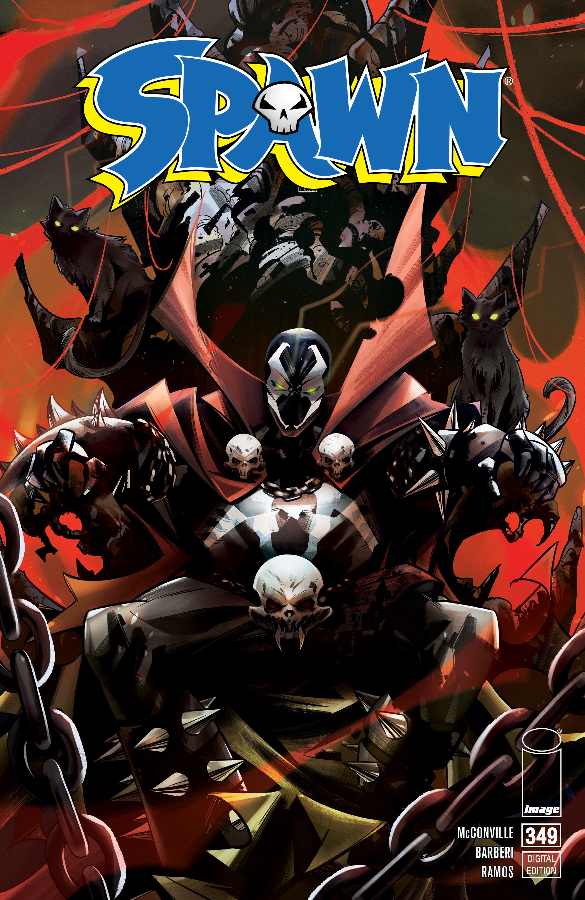
Spawn #349
Script/ Plot- Rory McConville
Art- Carlo Barberi
Jay David Ramos- Colors
Tom Orzechowski- Lettering
Federico Sabbatini, Mirko Colak- Cover Artists
Todd McFarlane- Creative Director; Edits
Thomas Healy- Editor-in-Chief
Image Comics
Released 1/24/24
24 pages, paperback
I finally read a Spawn book for the first time ever (don’t @ me). And what a choice it was to jump in right before the great and awful battle for Hell’s throne! Spawn has always been a comic blindspot for me because I couldn’t bring myself to care about the seemingly edgelord nature of the whips and chains and guns and demons. Maybe my mom gave me too much haterade as a kid. However Rory McConville is an excellent writer that does well with fantasy titles so my interest was piqued. Spawn #349 is chock full of political intrigue akin to Game of Thrones, but not enough interesting character work that Game of Thrones excelled at. There were so many different factions vying for the throne in Spawn it was too hard to follow. But I don’t blame McConville’s writing. All of the characters have clear voices and motivations so you can start to pick up on bits of characterization in this exceedingly large cast. My biggest issues lies with Carlo Barberi’s art.
I’ve admitted I’m not familiar with this series which clearly has enough lore and backstory and cast of characters to cover nigh on 350 issues, but everyone looked so similar, and they were all (mostly) dudes. How am I really supposed to tell anyone apart other than one dude is red and one dude is blue but they have roughly the same bulky build and unrealistically muscly features? Only one character’s design stood out as above the rest and that’s our titular character, Spawn. When he appears it’s a marked improvement to the book. His design is unique and intimidating. This is definitely a boysboysboys book through and through. Whips and chains and blood and a very small smattering of scantly clad women are the quintessential aesthetic for Spawn… at least that’s what I thought.
And I was right. So right. So painfully right.
But all the parts of this book were technically serviceable and surprisingly there’s nothing outright offensive or gross. I’m certainly not a Spawn convert, but I wouldn’t be so quick to shut down The Editor maliciously choosing another Spawn book to torture me with in the future.
👑👑👑
Uh-oh, Brownout
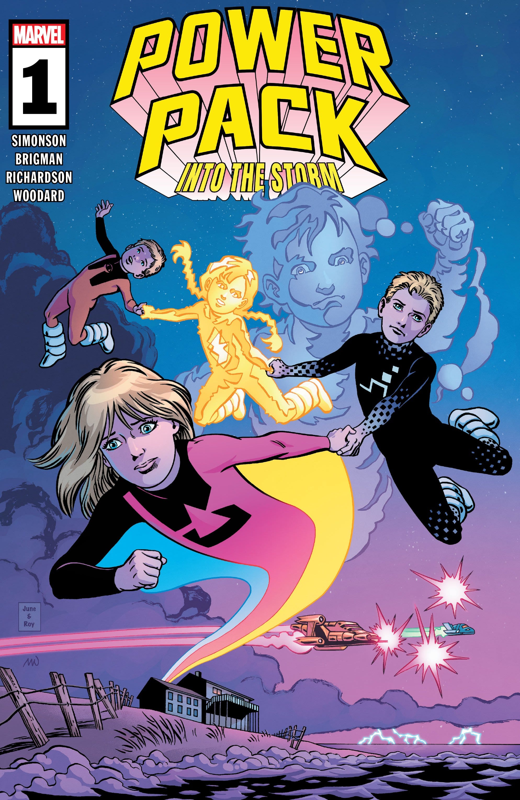
Power Pack: Into the Storm #1 (of 5)
Writer- Louise Simonson
Artist- June Brigman
Inker- Roy Richardson
Color Artist- Nolan Ward
Letterer- VC’s Travis Lanham
Cover Artists- June Brigman, Roy Richardson, & Nolan Woodard
Marvel Comics
Released 1/24/24
28 pages, paperback
Power Pack: Into the Storm is a book that should’ve worked on paper. Marvel’s recent push to bring back female creatives from their ‘70s and ‘80s bullpen has been an electric thing to watch. Bringing back both women who created Power Pack, the first superhero title to be written and drawn by women for more than a few issues, seemed like a winning idea. Louise “Weezie” Simonson has been killing it on Jean Grey recently, but June Brigman hasn’t worked at Marvel since 2019’s Power Pack: Grow Up, she’s been largely out of mainstream comics since the early 2010’s. It was such a refreshing sight to see Weezie and Brigman’s characters play in their original style with vast upgrades to their coloring and streamlines to their design. The magic of the original Power Pack book is seeing these very little kids struggle to learn their new abilities, but still overcome insurmountable odds and villains. And Into the Storm knew what notes to hit for longtime fans of the Power family to be engaged: its adorable, its bright, and its accessible. But only in the art. The writing this time around just isn’t any of those things.
Every gorgeous panel is packed to the gills with long and overwrought exposition that is heavy on sci-fi world-building and clanging with clunky dialogue. Brigman hasn’t lost a step in designing wacky alien worlds and incredible monsters and different races of creature, but all the humans have the exact same face. The one thing this story did right other than Nolan Woodard’s exceptional coloring, is capture what a wild fever dream of a story Power Pack was and is. However, this iteration left me with a far less whimsical taste in my mouth and a much larger headache. Into the Storm isn’t bringing anything new to the table as far as style or messaging, so you’re not missing much if you pick up a different book this week.
👑👑
Bury the Bodies
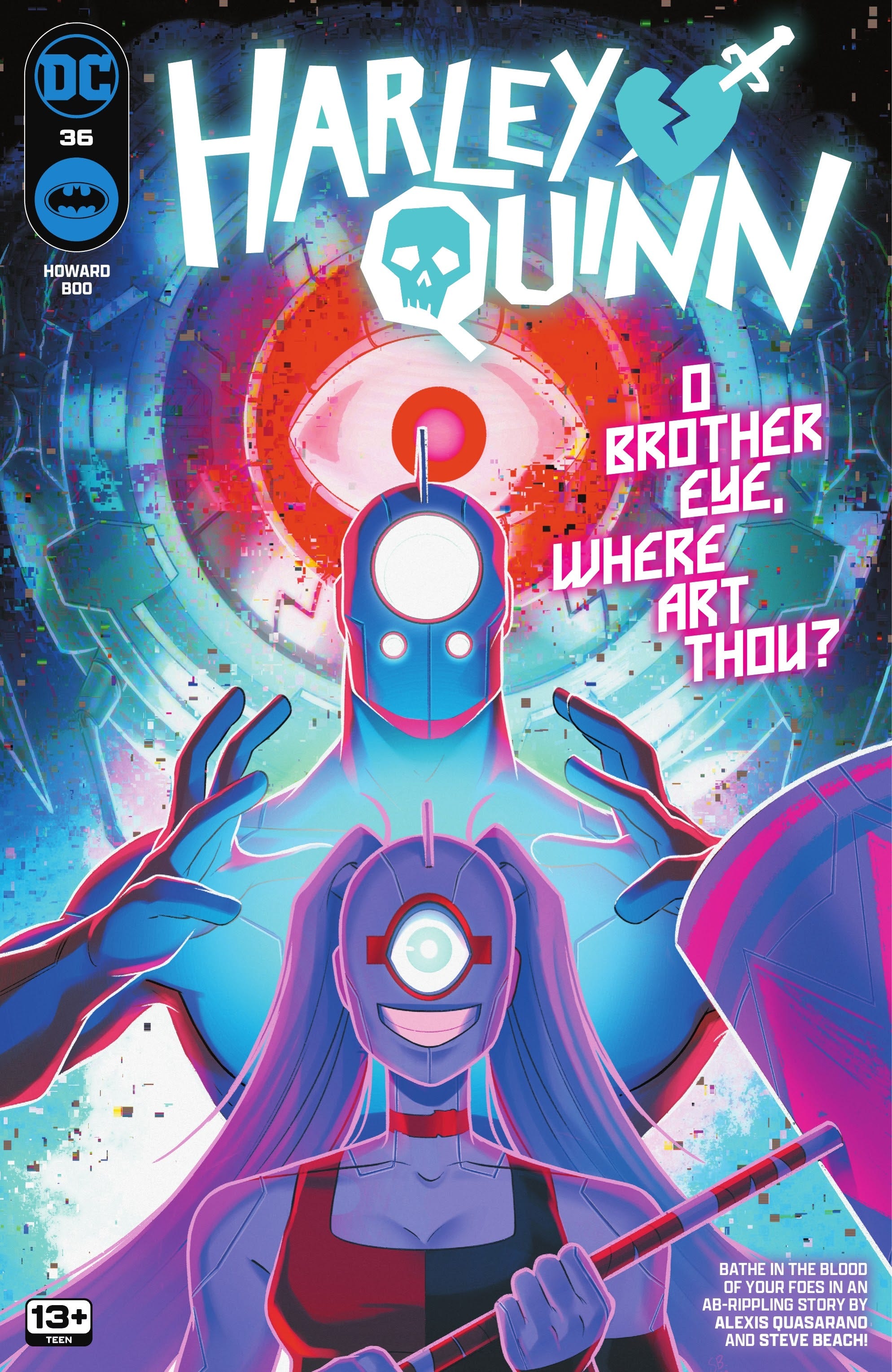
Harley Quinn #36
Tini Howard- Script
Sweeney Boo- Art and Colors
Steve Wands- Letters
Sweeney Boo- Cover
DC Comics
Released 1/23/24
36 pages, paperback
How well do you know your best friend? I’d like to think I know mine as well as Harley knows Kevin. That is I could track him down based only on seeing a series of decisions he must make and choose the outcome I deem most likely for him to choose. Harley Quinn #36 jumps right into chaos with one of DC’s most chaotic characters and it never apologizes. Which is just endearing.
Bud and Lou, Harley’s pet hyenas are now bipedal and sentient? There’s this weird pink ether covered in eyes that is apparently a dude or a multiversal highway they are traversing? I honestly didn’t quite grasp what was happening until halfway through this issue, but I’m so glad I gave myself over to the ride.
Tini Howard’s voice for Harley is immaculate. She’s batshit crazy and riotiously oblivious, but saccharine sweet and endlessly hilarious. I’ve never understood what a guffaw was until Poison Ivy calls Harley and says “Hey Harley. You look busy.” To which Harley replies, “You look busty.” And this type of wordplay is exactly what I was looking for. The repartee between this diverse cast of characters never stops hitting and makes this issue exciting and laugh out loud fun start to finish.
Sweeney Boo’s art is stunning and her colors are like looking directly into a rainbow’s mouth (hey, if ether can have eyes, rainbows can have mouths) as it vomits all over you. But her page layouts and panel structure are eclectic, vibrant, and kinetic. They actually feel kind of psychotic like Harley herself. And these character designs are quirky and weird in all the best ways.
There is a backup story written by Alexis Quasarano, drawn by Steve Beach, and lettered by the GOAT, Hassan Otsmane-Elhaou, that came out of left field and left me reeling. It’s a sword-and-sorcery tale called ‘Harley the Barbarian’ and it made the entire issue. Don’t get it twisted, up till now, I’m sure that the craziness I’ve seen fits perfectly into Howard and Boo’s ongoing narrative like pickles and cottage cheese (trust me, it’s delicious), but ‘Harley the Barbarian’ is everything you could want from such an irreverent character, written and drawn with tons of reverence. Beach’s art is breathtaking and epic. There is such lifelike incredible detail given to every rippling muscle in Harley’s design or the willowy wisps of moss and grass for Ivy. This eight page story ends with Harley waking up from the dream and she’s not actually a Barbarian, but up till the last panel, this has all the watermarks of a deeply rich elseworld story that needs exploring.
👑👑👑👑👑
We Do Have the Tendency to Go On…
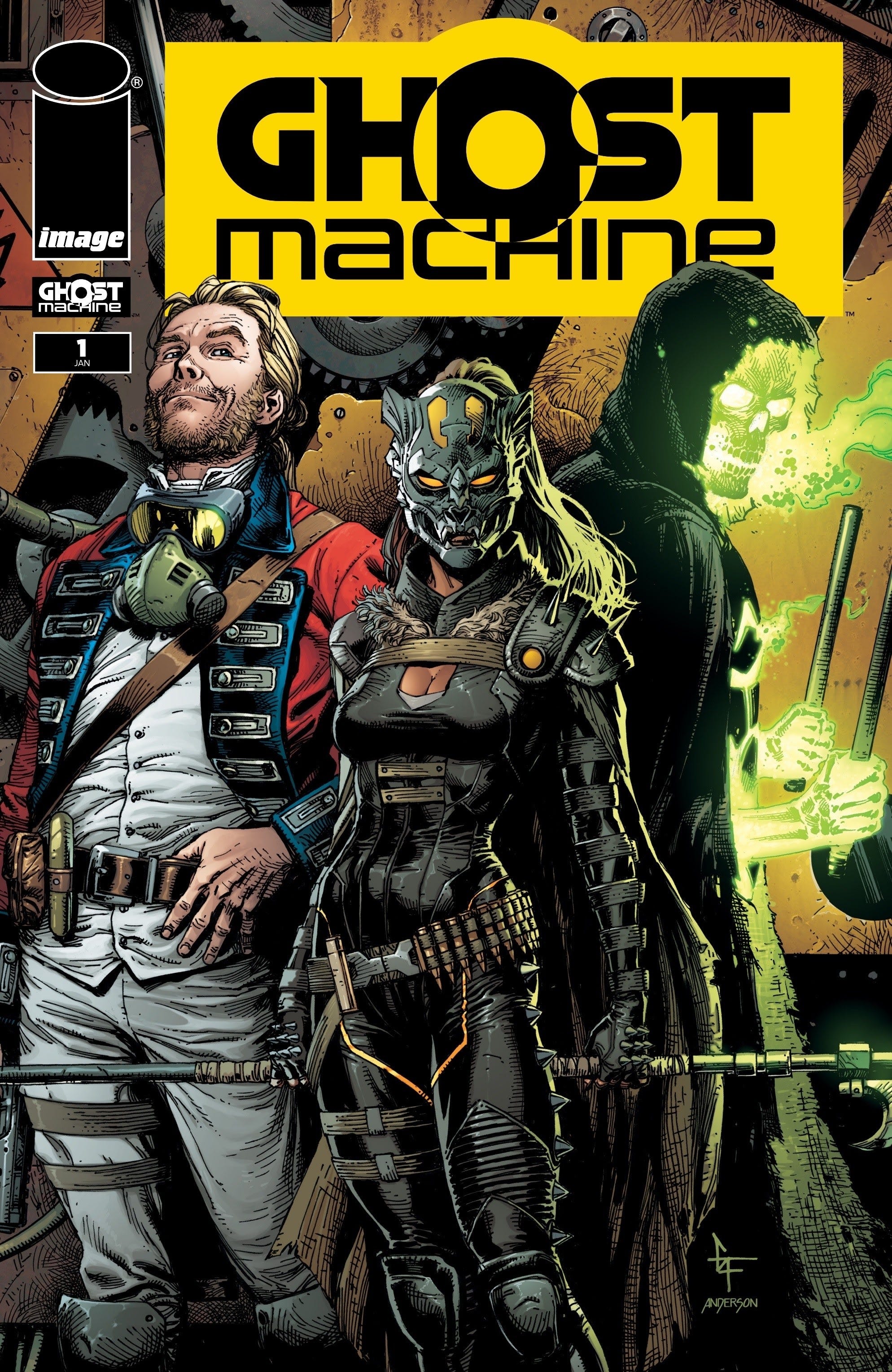
Ghost Machine #1 (One-Shot)
Creators: Jason Fabok, Gary Frank, Bryan Hitch, Geoff Johns, Lamont Magee, Francis Manapul, Brad Meltzer, Ivan Reis, Peter Snejbjerg, Peter J. Tomasi, Maytal Zchut
Brad Anderson- Colorist
Rob Leigh- Letterer
Cover Artists- Gary Frank & Brad Anderson
Ghost Machine (Image Comics)
Released 1/24/24
64 pages, paperback
This week Ghost Machine premiered from a new imprint at Image Comics (also not at all confusingly named Ghost Machine), ushering in a new wave of creator-owned titles that are focused on character first. With an all-star lineup of creators having mainly worked at DC or Marvel, Ghost Machine put together their eponymous one-shot as a way to welcome fans to their diverse collection of stories and characters.
Ghost Machine #1 comes across like the old Marvel Guidebooks from the 80’s. There are a couple teaser-like short stories that set up the vibes of the characters which are followed by text pages profiling this motley crew. In ‘The Unnamed Corner’, we meet Geiger, a walking nuclear bomb that roams a near-future wasteland in search of revenge for his murdered family. Geoff Johns and Gary Frank tell the story of Geiger through a spooky campfire tale where a father warns his kids about the mysterious glowing man. Gary Frank has an incredible eye for composition and renders this wasteland with stunning detail and shading with deft crosshatching. The shaky panel borders evoke a precarious and dangerous world. Geiger is terrifying, but he is also just and keeps a clear code that makes him think he’s a hero. Did I mention he has a two-headed wolf as a terrifying sidekick? Johns’ character work is shallow, but it teases enough to make the audience want to check out where this character came from. And that is a running theme in this one-shot.
In an awkward transition, the scene jumps back in time to an America during the Revolution. Simon Pure, a witty, detestable, and all-around scoundrel that goes by Redcoat, learns he is immortal and details the interesting historical characters he’s met in his travels from Benedict Arnold (another immortal) to Annie Oakley to Albert Einstein. Bryan Hitch’s art is very Bryan Hitch: its cinematic and widescreen; its got great use of facial acting which makes each character distinguishable, but it’s a tad uninteresting and crowded during big action sequences which should focus more on body movement than chewing scenery.
Geoff Johns clearly loves this cheeky Redcoat as his character comes across far more clear and defined than Geiger. During Redcoat’s sequence of introducing interesting historical characters, we are teased with appearances from Junkyard Joe, another upcoming Ghost Machine title about a robot soldier in Vietnam, The Northerner, a solemn and mysterious Civil War soldier, and finally jumping back to Geiger’s present to insinuate all these folks are fighting something called the Unknown War across time.
The Unnamed section of the book deals with characters that have already appeared or have been introduced in titles from Image that are being brought under the Ghost Machine umbrella, but all the subsequent sections introduce new and upcoming titles and characters. Next up, Geoff Johns and Jason Fabok introduce their hard-boiled sci-fi epic, Rook: Exodus.
On the planet Exodus, individuals called Wardens wear helmets that allow them to control different breeds of animals. Everything on this terraformed planet is controlled by humans. But something called the “world’s engine” failed and now all that’s left are the corrupt wardens and their vicious packs of animals in their thrall that must navigate the war torn world. It takes a bit for this concept to sink in and even longer before you realize the action of this story is somehow starting after a major event that isn’t given much detail. However, Johns’ characterization of Rook, the protagonist who can control flocks of rooks, ravens, and crows, as well as his buddy, Swine (guess what he is the Warden of) is immediately fun and captivating.
Jason Fabok’s design is like an updated 90s aesthetic: guns, pocketed pants and jackets, and an excessive use of chains and straps, but the levity between Rook and Swine juxtaposes the art in interesting ways. This teaser comic left off with tons of unanswered questions including, “do I even care about the answers?”. The following pages showcase Fabok’s character design which is, admittedly some of the best in the Ghost Machine canon, especially the design for Dire Wolf who is only hinted at in the teaser.
Part three of Ghost Machine gives a tour of the family titles they hope to offer in the coming months, and honestly, this is where the book starts cooking. The Rocketfellers (absolute 10/10 title, amazing job, no notes) are a family from the future that have enlisted in a program to hide back in time (2024) from a nemesis bent on destroying the future. Peter J. Tomasi and Francis Manapul need to give notes and lectures to their contemporaries at Ghost Machine.
The Rocketfellers is simply the best teaser in this book. Tomasi crafts each character’s voice with heart and attention. Every character is given deep backstory and internal lives that are so unique even though all their names start with ‘R’. Manapul’s style is cutesy with touches of Norman Rockwell and the Jetsons. It’s the perfect tone for this book that promises action and adventure like a classic sci-fi pulp and the ending shows a surprising Easter Egg of the family attending a Junkyard Joe drive-in movie! This is the Ghost Machine title to look for on shelves in the next few months.
Hornsby and Halo is an intriguing take on the nature vs nurture question by following a demon and an angel who are removed from their homes at birth and switched. The two celestial kids grow up on Earth, but pass as regular children that face each other in a spectacular little league game. Tomasi and Peter Snejbjerg craft a wonderfully mysterious and cheeky story that doesn’t come right out and say what it is until the end. And that’s extremely impressive considering the short length of each of these teaser comics.
The final piece of the Ghost Machine pie is Hyde Street, a collection of Ghost Machine’s horror title or titles(?) all drawn by Ivan Reis and co-written with Geoff Johns, Maytal Zchut, and Lamont Magee. This is the most confusing part of the book. In the table of contents it lists three stories here, but with Reis drawing all three and there being no real shift in narrative other than abrupt scene change and an abhorrent vague through line, it’s too hard to follow. Hyde Street tries to coast on vibes only and it comes up rather short.
I knew this review was gonna go too long (Who edits this fucking thing anyway? - The Editor), and it may seem like I didn’t enjoy it. However, at 64 pages, with a card stock cover, a litany of first appearances and new character bios perfect for new and uninitiated fans, there truly isn’t anything on shelves this week with a better bang for your five bucks than Ghost Machine.
👑👑👑👑