


Kurt Busiek's Migraine Reading

I’m happy to be back in the saddle again. This place was getting a little too Big Two for me. That’s why we’re starting with….oh…dammit.
Look, I might make the rules but I really don’t ever enforce them.
Kelley “Springform Pan” Malloy has this week’s reviews.
I’m A Picosecond From Losing It

The Flash #1
Writer- Si Spurrier
Artist- Mike Deodato Jr.
Colorist- Trish Mulvihill
Letterer- Hassan Otsmane-Elhaou
Cover by Mike Deodato Jr. & Trish Mulvihill
DC Comics
Released 9/26/23
43 pages, paperback
When I hear the name Si Spurrier, I associate it with some of the best fantasy comics of the last decade. His world building is second to none. So when I learned he was being given the reins of the Scarlet Speedster, I was certainly intrigued.
The Flash #1 opens with Max Mercury and Impulse attempting to tap into the Speed Force and time travel, but it backfires and the two are left reeling with an ominous vision seared into their minds. Spurrier’s foreshadowing of a new threat, The Uncoiled, is terrifying cosmic horror on a scale I haven’t seen any superhero face in awhile. Spurrier also knows the classic notes to play for longtime fans of Wally West and the Flash family.
Our main story opens with Wally attempting to thwart Gorilla Grodd from whatever evil plan is allowing him to level up, get faster, and abduct cops and civilians in frozen time stasis bubbles. Wally is helpless as he sees hundreds of people being plucked off the streets and floating away in tot the ionosphere. Luckily Wally has such a great support shatter around him and Spurrier has done a wonderful job of filling out this supporting cast with a super genius billionaire in Michael Holt aka Mr. Terrific, two wild kids that can’t help but play with their new Speed Force powers, Irey and Jai West, and my personal favorite in this issue, Wally’s wife, Linda Park-West. Linda is an island in the West household.
After recently giving birth to Wade West, she is officially the only person in her house that cannot move at super speed and this takes a terrible toll on her. While pregnant, Wade “lent” her his speed and Linda got a chance to feel what it’s like to move between the seconds, but now everything is a blur. Spurrier’s characterization is sad and calculated down to her inner monologue, displayed like newsprint in the margins.
Mike Deodato Jr.’s art in this book is what make it sing. From the first page we are introduced to a motif of extra half-panels appearing in the left and right margins. It gives the effect that the action could run in from the left or run off the page to the right at any moment and continues throughout the book. This choice has a twofold effect: it adds an extra level to how the audience’s eyes and brains read the extraordinary speed; it’s a kinetic effect that draws the eye to the right and down at breakneck speed. It also ties into the cosmic horror of the Uncoiled as you scan the margins for hints or terrifying clues of what lies beyond our typical perspective in a comic.
I’m the biggest shooter for Hassan Otsmane-Elhaou’s stunning digital lettering always giving unique voices to characters and playing into giant scale fight scenes with epic SFX. That, combined with the deep, dark, saturated colors by Trish Mulvihill, round this first issue out as something to keep an eye on. This issue delivered the perfect amount of drama, heart, suspense, horror, cape nonsense, and humor needed to hook readers new and old.
👑👑👑👑👑
Bunny Banzai
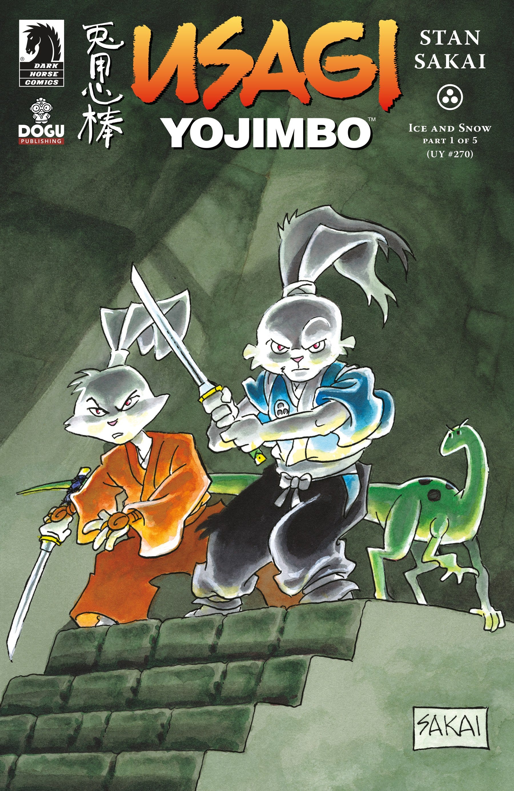
Usagi Yojimbo: Ice and Snow #1 (of 5)
Story, Art, and Lettering by Stan Sakai
Color work by Hi-Fi Colour Design
Dark Horse Comics
Released 9/27/23
32 pages, paperback
Usagi Yojimbo is back at Dark Horse! After writing, drawing, and lettering the comic for 40 years, Stan Sakai shows no plan to let up on his epic tale of the ronin rabbit in Edo era Japan.
In Ice and Snow, Miyamoto Usagi and his cousin, Yukichi, traverse a terribly cold mountain in search of shelter and warmth. Soon, the pair of sword-wielding bunnies are attacked by a gang of bandits who they summarily dispatch with great skill and almost no bloodshed. This is one of my favorite things about the Usagi books. They are clearly about a violent character living in a bloody era of civil war in Japan, but these books can be read by anyone of any age. Even when a ruffian meets their untimely demise a few pages later at the hands of Jei (Usagi’s longtime wolf nemesis), they simply faint down and off panel. The following label simply shows a floating cartoonishly ghastly skull floating up from the ground. This dichotomy, and others, set the tone of a great Usagi book. One where silly and serious, violent and gentle, quiet and rambunctious, scary and soft are all packed into twenty-something pages.
After 4 decades of drawing the same beautiful world of anthropomorphic animals, Stan Sakai hasn’t lost a single step in his masterfully intentional linework. With a scant few feathered lines he can render full embarrassment or dread in a character’s face, deliver a silly punchline for the otherwise stoic Usagi, and, of course, show epic, large, sweeping battle scenes across the page. Sakai is a master of character design. Jei is an imposing and scary villain with white eyes and no pupils. Usagi is composed and strong. But the way he draws the hundreds of rough and tumble, cannon fodder bad guys he throws at both Jei and Usagi are lively, animated, unique and so much fun to look at.
Sakai just won the Eisner Award for Best Lettering…again! He’s won 6 of his 13 nominations for this award all for Usagi Yojimbo and it’s no surprise either because the man never misses! His carefully placed balloons and sound effects never take away from the story or art, but supplement both in a way that continues to stand out. I am a longtime Usagi fan, but I’m used to reading the books in black and white. With the addition of Hi-Fi’s coloring in this book, I was nervous it would detract from the linework or be distracting where I didn’t need color in the past. However, I was pleasantly surprised at the care given to the color palette. Simple gradient shading laid over mainly flat colors was a great choice because it showcases the linework, pushing it front and center. Issue 1 of Ice and Snow was the perfect hook for a new Usagi story that is back at its home with Dark Horse. I’m extremely excited to see where this one goes.
👑👑👑👑👑
Less Cheese, More Cake
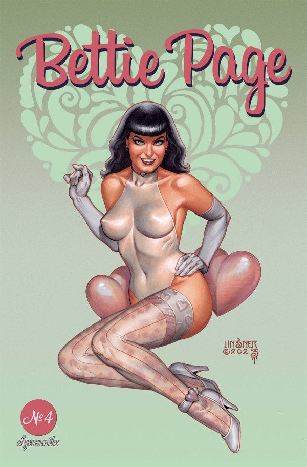
Bettie Page #4 (of 4)
Writers- Mirka Andolfo & Luca Blengino
Illustrators- Elisa Ferrari with Mara Angelilli & Tommaso Ronda
Colorists- Mauro Gulma & Francesca Vivaldi
Letterer- Jeff Eckleberry
Main Cover- Joseph Michael Linsner
Packager & Editor- Nate Cosby
Dynamite
Released 9/27/23
30 pages, paperback
After The Editor took a couple weeks off, and I got to choose whatever cheesecake, superhero, Big Two nonsense comics I wanted, but this week we returned to our roots of trying to pick the most random books we could read and review. Since The Editor chose a rather obscure book (more on that next), I figured I had license to check out a book off my normal beaten path as well.
I recently read Mirka Andolfo’s Sweet Paprika which is a steamy piece of comics erotica and humor I haven’t seen since Sex Criminals, so I was intrigued by the idea of her writing for Bettie Page. Issue #4 of the Dynamite series wraps up the miniseries about the Hollywood bombshell actress and the hijinks involved in her international plot of intrigue. This book was cute. The stakes are set super high right at the beginning but the loose and curvy art and bubbly character expressions make you feel like there’s no serious danger even though we’re dealing with mafia hit men and kidnapping. There is a great joke throughout the issue that I’m sure permeates the whole miniseries about Bettie going all the way to Italy and only wants to try an authentic Margherita pizza, but it never comes to fruition. In fact just as she is about to taste her first slice, she is tackled to the floor because a would-be assassin takes a shot at her and ultimately destroys the pizza.
The character design in this book had highs and lows. The supporting cast are all unique and lively and stand out in the page. However, the plot to disguise Bettie as mob granddaughter, Lisa Cosmi, left my head spinning as the two rarely appeared in page together therefore rendering them as the same person in my mind. The storytelling never takes itself too seriously, stopping and starting at different points to go back and set more things up in comedically timed moments. Gulma and Vivaldi’s colors, though, are where this book comes to life. Each page is carefully laid out with a different palette that heightens the drama, lands every joke, and shows the beauty of Italy through stunning sunsets and vibrant scenery. Based on the cover and the writer alone, I expected a raunchy and salacious book about Bettie Page, but the surprise is this book has a lot of heart, cute humor, and an almost Archie-like quality to character design.
👑👑👑
There’s A Big World Out There
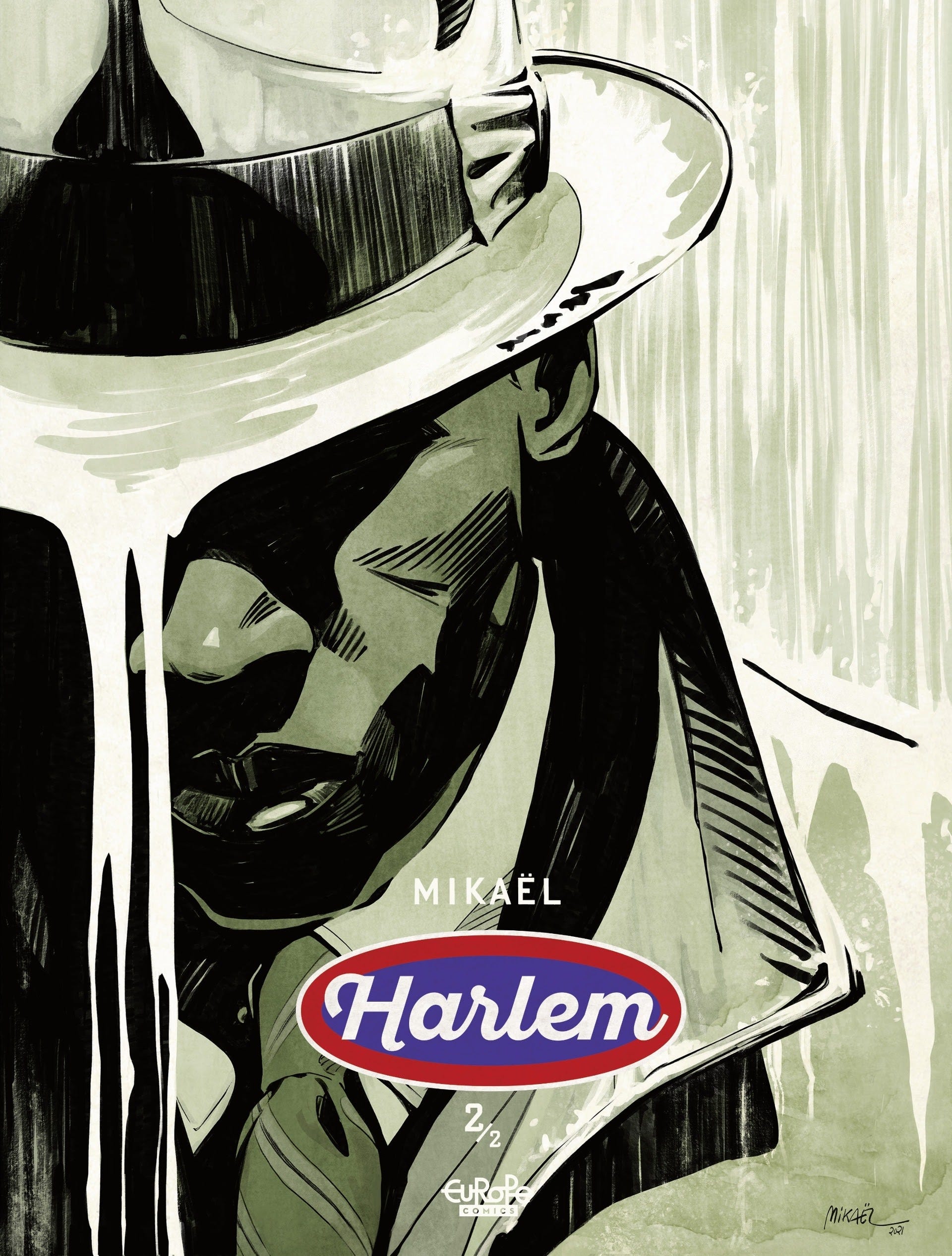
Harlem 2 (of 2)
By Mikaël
Translated from French by Tom Imber
Editing: M.B. Valente
Lettering: Cromatik Ltd
Graphic Design: Philippe Ghielmetti
Originally published in French by DARGAUD BENELUX (Dargaud-Lombard s.a.)
Europe Comics
Released 9/27/23
64 pages, paperback
Thank goodness The Editor likes to pick indie books or we’d never cover them here! He truly is the cultural paragon of Comic Rex and this week, he set me on task with reading a grown up comic, Harlem 2 by Mikaël. This 64-page sequel tells the story of Stephanie St. Clair, the queen of Harlem’s illicit gambling scene as she vies for control of the lottery, protection of her people, and keeping Harlem culture alive against the conniving Dutch Schulz and Captain McCann of the 32nd precinct.
This is a dense book that isn’t afraid to meander or take an extra couple pages to flesh out its supporting cast. And the cast is the best part of this book. Each character has so much care and attention given to not only their unique aesthetic designs but also to their personalities. St. Clair herself always appears regal, elevated, and deadly, even when she’s knocked to her lowest. Bumpy gives you every reason not to trust him through his shady interactions, but always comes through for St. Clair as a tried and true loyalist. Even the villains, Schulz and McCann, are not just one-note racists that hate the Black woman that is gaining territory in Harlem. They also appear as compelling characters trying to proliferate the power of the Dutch and the Irish.
The art in Harlem is so wonderful and painterly. It’s a sepia color palette of earth tones, but the pencils underneath run the gamut of the full range of human emotion, picturesque cityscapes, and the musicality of jazz in Harlem. The use of gray-blues and yellows in the silent flashbacks was a genius way to deliver the drama needed. It somehow gave the effect of appearing brighter and less gritty than the present, while still being of an older time.
Mikaël’s characters are cartooned in a way that Scott McCloud discusses in Reinventing Comics. I’m paraphrasing, but he writes that the more realistic the humans are drawn, the more artists tend to render everyone looking the same. However, one of the many talents of Will Eisner, and I’d argue Mikaël as well, is that the use of more cartooning can lead to an actual believable variety of human expression. Just flip through the last 8 pages of Harlem and you’ll first read I, Too by Langston Hughes which is a perfect tone-setting for the book, but then you’ll see the character design sheets where Mikaël’s care can be seen in each face, each body, each life that he depicts.
A note about the lettering in this book. I often wonder what gets lost in translation from other language comics to English, but I hope the lettering remains consistent throughout for Harlem because the loose, scrawled lettering added so much drama and musicality to the script it was hard not to notice, but never took away from the words on the page. Harlem is a reminder why European comics deserve to be watched as much as their American counterparts because of the way they break traditional forms and can deliver unique storytelling through different beats, methods and art styles.
👑👑👑👑👑
King’s Edict
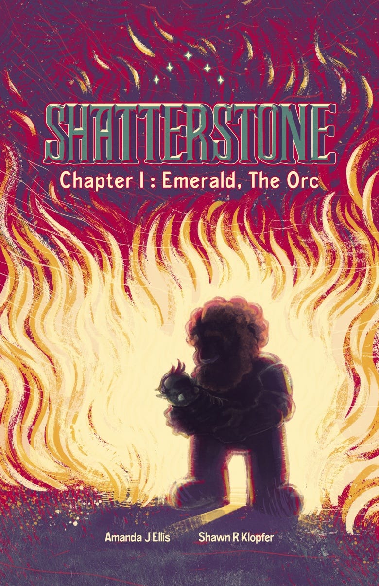
This week, we had the distinct pleasure of being sent a brand new webcomic for review called Shatterstone. This awesome fantasy comic by Amanda J Ellis and Shawn R Klopfer follows Emerald, the orc and her dwarvish foster father, Hogarth Shatterstone. After Emerald’s village is attacked and she is the only survivor, Hogarth takes her in and raises her with kindness and love. He tells her the stories of legendary heroes and gods that are alive in the constellations. He teaches her to make jewelry and blacksmith with the skill of a dwarf. When she comes of age, Ükakalá, another orc, petitions Hogarth to let them train Emerald in the ways of her warrior culture. But Emerald wants to know why there have never been any orc kings and queens or heroes of lore?
This is a wonderfully magical tale about who gets to be called hero that sets up what promises to be a tale of epic scale. The artwork is so crisp and vibrant it truly jumps off panel and off page. The curvy, and soft edges to everything give a sense of childlike wonderment to the world around Emerald and the glittering stars, and flashy colors fill out a bombastic canvas for her to play in. But there are scenes of immense violence and terror as well that are treated with the same level of care and love. The use of silent panels gets across so much of the story with so very little text that it relies on your emotions to fill in the traumatic gaps of Emerald’s life. This is all paired with silly gags like Emerald head butting a goat and sweet moments like Hogarth weighing his daughter’s difficult training on his mind against his tender and loving way he raises her. I got to the end of Shatterstone chapter one too fast and I NEED more of it soon because this story has already got its hooks in me.
The first chapter is available for purchase at https://ko-fi.com/s/db59bdc9fb and you can support the creators as well by checking out https://amandajellis.com/ . Thanks again to Amanda and Shawn for sending this over as it was truly a highlight to read this week.
Thank you so much for featuring Shatterstone in the King’s Edict! I’m excited to say that Shatterstone will return soon! Chapter 2: The Broken Spears, will start updating October 6th on Patreon. https://www.patreon.com/amandajellis
Thanks again!
-Amanda